Font Design for your Product
Fonts bring attention to your message
- Size does matter
Depending on what you need your customers to read first you must size the fonts appropriately. This is especially true for content based websites and for help files. Consistency of size throughout the product for page titles, breadcrumbs and settings is critical and should be part of your styleguide. Places where you do not want to grab that much attention, areas within the product more often skipped by a customer are places you can use small fonts.
- Backgrounds and Context
This is more of an advertising technique but equally applicable in product design. Let’s say you have two texts of the same font size. I can easily grab more attention to one of the texts by applying a darker background or just highlighting it with a different background color. With fancy Javascript libraries nowadays I can also dynamically add a transition to that text or add an arrow (pointer) to that text to force the users to look there.
- Purpose driven fonts
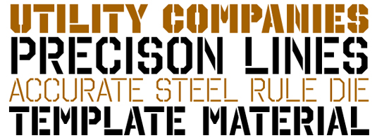
The messages here is that you need find what purpose each font has withing your product / content. Quoting Jame George - Some fonts have predefined purposes - for example “Stencil” . Stenciling is meant to be bold. Because of its rugged constructivist nature, it is usually used on something that has to do with buildings or structures.

You might see Stencil used on the side of a sheet metal tool box, but it’s not likely that you would see it on a wedding invitation, or something that is designed to be formal or elegant. Stencil is thick with sharp edges, and it is very masculine in nature. It isn’t inviting or warm, and its overall purpose is not so much decorative as it is utilitarian.
- Contrast of font styles
This is another technique which helps add more clarity to font responsibilities within your content or product. In terms of content it is important to have a different font for your title and your body. The same thing applies to your product, a good example within the context of a form is a different font for each section of a Form and a different font for your Form fields.
- Readability
Ensure that the Fonts for your key messages are readable. Keep it simple, easy-to-read, enough spacing between the letters. A good rule of thumb is that typically no running Fonts are used within product screens. There are cases when some products do need running Fonts and it’s usually when they want to show a personable message or when they want to send out a more engaging invitation to a user. In cases like this the Font size makes a big difference.
